
Web Design
Revest: Designing a High-Trust Property Investment Website
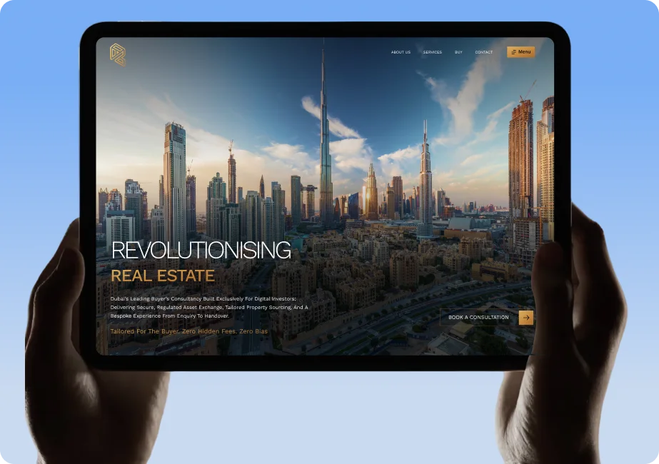
Revest guides investors through a considered, high-value decision. This is how the site was positioned, structured and built to match that — and which parts of the approach apply to any business selling something expensive.
Contents
Most website projects are described in terms of pages. The useful ones are described in terms of decisions — what the visitor is being asked to do, how much it costs them, and how much confidence they need before they will do it.
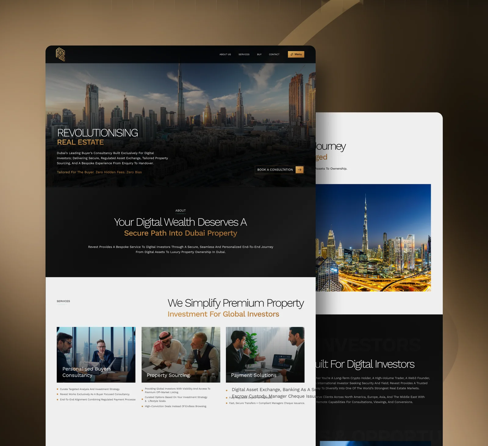
Revest is a buyer-focused property consultancy working with international and digital-asset investors moving into Dubai property. That is a considered purchase made largely at a distance, often by someone who has never met the team. The design problem was not decoration. It was confidence.
The full breakdown of the work — screens, sections and design decisions — sits on the Revest case study. This article covers the thinking behind it, and how the same approach applies to other businesses I work with from Glasgow and Edinburgh.
01
The brief
Reimagine the Revest digital experience around stronger visual hierarchy, clearer structure and a more sophisticated presentation — one aligned with the value of the service rather than the conventions of a typical property listing site.
- Communicate confidence, quality and clarity from the first screen.
- Make the offer legible in seconds, not paragraphs.
- Support a decision that happens over weeks, not minutes.
- Work as well on a phone in another time zone as on a desktop.
02
Positioning before pixels
Short answer
A website for a high-value service is a positioning exercise first. If the visitor cannot tell within a screen and a half who this is for and why it is credible, no amount of visual polish recovers the visit.
Before layout work started, the offer was written out plainly: who Revest serves, what the engagement involves, and the questions an investor asks in order. Those questions became the page order. Everything visual followed from that sequence rather than from a template.
03
Designing for a high-value decision
Cheap products are sold with urgency. Expensive ones are sold with calm. The Revest interface uses restraint deliberately: generous spacing, a small number of type sizes, clear visual anchors and digestible blocks of information rather than dense walls of copy.
Trust is mostly a design of pace. Give an expensive decision room to breathe and people stay long enough to understand it.
Trust signals that actually carry weight
- A specific audience named on the first screen
- Plain description of what the service includes
- Consistent typography and spacing across every section
- No fabricated statistics or borrowed logos
- Contact routes that match how the buyer prefers to talk
- Fast loading on mobile networks
04
The investor journey
The core of the site is a managed journey: an investor arrives with a general interest, builds understanding of the process, then moves to a conversation. Each section answers a single question and hands over to the next.
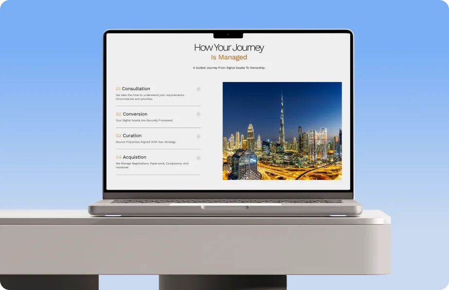
- 01OrientationWho Revest is for and what the service covers, stated without jargon.
- 02UnderstandingHow the process works, broken into stages a first-time overseas buyer can follow.
- 03AssuranceThe detail that answers the sceptical reader — structure, involvement and support.
- 04ContactA low-friction next step positioned where intent peaks rather than only in the footer.
05
Brand identity and palette
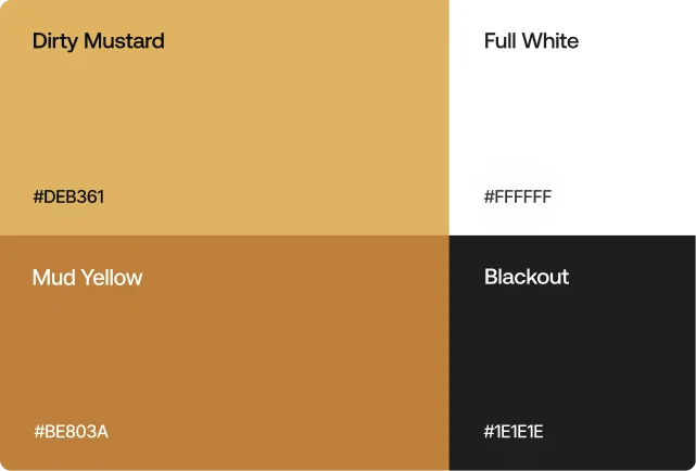
The visual identity was tightened alongside the site so the two read as one thing. A warm gold against near-black and white gives the pages a premium register without resorting to heavy gradients or stock photography.
Why a narrow palette helps
Limited colour forces hierarchy to be carried by structure and spacing. It also survives contact with real content far better than a palette that depends on decorative accents, and it makes accessible contrast ratios straightforward to hold.
06
Responsive design and performance
International buyers browse on phones, frequently on mobile data. The layout was built mobile-first, with typography and spacing scaling rather than collapsing, and imagery served in modern compressed formats so the first screen paints quickly.

| Decision | Reason |
|---|---|
| Mobile-first layout | Majority of first visits to high-consideration services arrive on phones. |
| Compressed modern image formats | Protects Largest Contentful Paint on mobile connections. |
| Restrained motion | Motion supports hierarchy; it should never delay reading. |
| Semantic headings and landmarks | Accessibility and crawlability come from the same structure. |
07
The SEO foundations underneath
A redesign is the cheapest moment to fix search fundamentals, because structure is being written anyway. On Revest that meant one clear H1 per page, descriptive headings that match how buyers phrase their questions, meaningful image alt text, clean internal linking and metadata written for humans first.
The longer version of that checklist — technical SEO, local search, AI answers and reporting — is in the SEO Glasgow guide. How design and SEO fit alongside paid media and conversion work over a year is covered in the Digital Marketing Scotland 2026 guide.
Search foundations set during the build
- One H1 per page, headings in a logical order
- Descriptive, non-duplicated titles and meta descriptions
- Alt text that describes the image, not the keyword
- Internal links between related sections and services
- Structured data where it reflects real page content
- Core Web Vitals treated as a build requirement
08
What transfers to your site
Very little of this is specific to property. Any business selling a considered purchase — professional services, B2B software, bespoke manufacturing, energy consultancy — faces the same problem: an unfamiliar visitor deciding whether to trust you with something significant.
- Write the offer in plain language before anyone opens a design tool.
- Order the page around the buyer's questions, not your internal org chart.
- Use restraint: pace and clarity read as competence at higher price points.
- Design mobile first and treat speed as part of the design, not a later fix.
- Bake search structure into the build rather than retrofitting it.
09
FAQs
How long does a website like Revest take?
A site of this scope typically runs across several weeks, covering positioning and content structure, design, build, testing and launch. The variable is almost always content readiness rather than build time.
Do you work with clients outside Glasgow?
Yes. I am based in Glasgow with an Edinburgh base in Leith, and work with clients across Scotland, the UK and internationally. Revest is an example of a project delivered largely remotely.
Can you handle brand identity as well as the website?
Yes. On Revest the identity and the site were developed alongside each other so the mark, palette and typography behave consistently across every surface.
Will a redesign affect my search visibility?
It can, in either direction. Handled properly — URL mapping, redirects, preserved content and improved structure — a redesign usually strengthens visibility. Handled carelessly it loses rankings that took years to build.
Where can I see the full project?
The complete Revest case study, including the screens and design decisions, is on the case study page linked throughout this article.
Planning a website for a high-value service?
Tell me what you sell and who buys it. I'll come back with an honest view of what the site needs to do and what it would take to get there.
Based in Glasgow with an Edinburgh base — working with clients across Scotland and the UK.
Continue reading
- Web DesignWeb Design Glasgow: Complete 2026 Guide →What quality costs, and how to choose between a freelancer, a specialist and an agency.
- SEOSEO Glasgow: Complete 2026 Guide →Technical SEO, local search, AI Overviews, costs and reporting that actually matters.
- Digital MarketingDigital Marketing Scotland 2026 →How design, SEO, paid media and automation combine into a 12-month growth system.